A revamp on the internal tool for A/B testing within the organization

Calculon
Problem Statement
Today, we find that Calculon has many different results pages which causes a lot of discrepancies in the UI, issues in UI implementation, and velocity problems.
The goal will be to make the results page a single page so that we can better provide information to the users, minimize re-use and prevent UI errors.
Objective
Help Agodans run better quality experiments and make better decisions
Provide accurate measurement of true value
Enable experimentation in new areas
Provide a smooth UI/UX for our tools (Calculon & FE Analytics)
Make sure our data, results, and tools are trustworthy
Help Agodans run better experiments and make better decisions
Improve signal-to-noise of experiments
Better recommendation
Show more relevant data to users (consider the lifecycle of the experiment)
Educate users
Promote learning from past experiments
Provide accurate measurement of true value for Agoda
Improve how eval run is done
Measure other benefits besides UBI
Enable experimentation in new areas
Experiment design and validation of new metrics, stats calculation, …
Scale up in terms of supporting teams (e.g. not just consultancy, but also providing tools)
Provide a smooth UI/UX for our tools (Calculon & FE Analytics)
More tooltips to explain how things work
Faster search
Unified UI
Make sure our data, results, and tools are trustworthy
Improve consistency between Calculon & FE Analytics
Display correct data and results in UI
Reliable and robust data pipeline
Minimize escaped bugs

Design Revamp
-
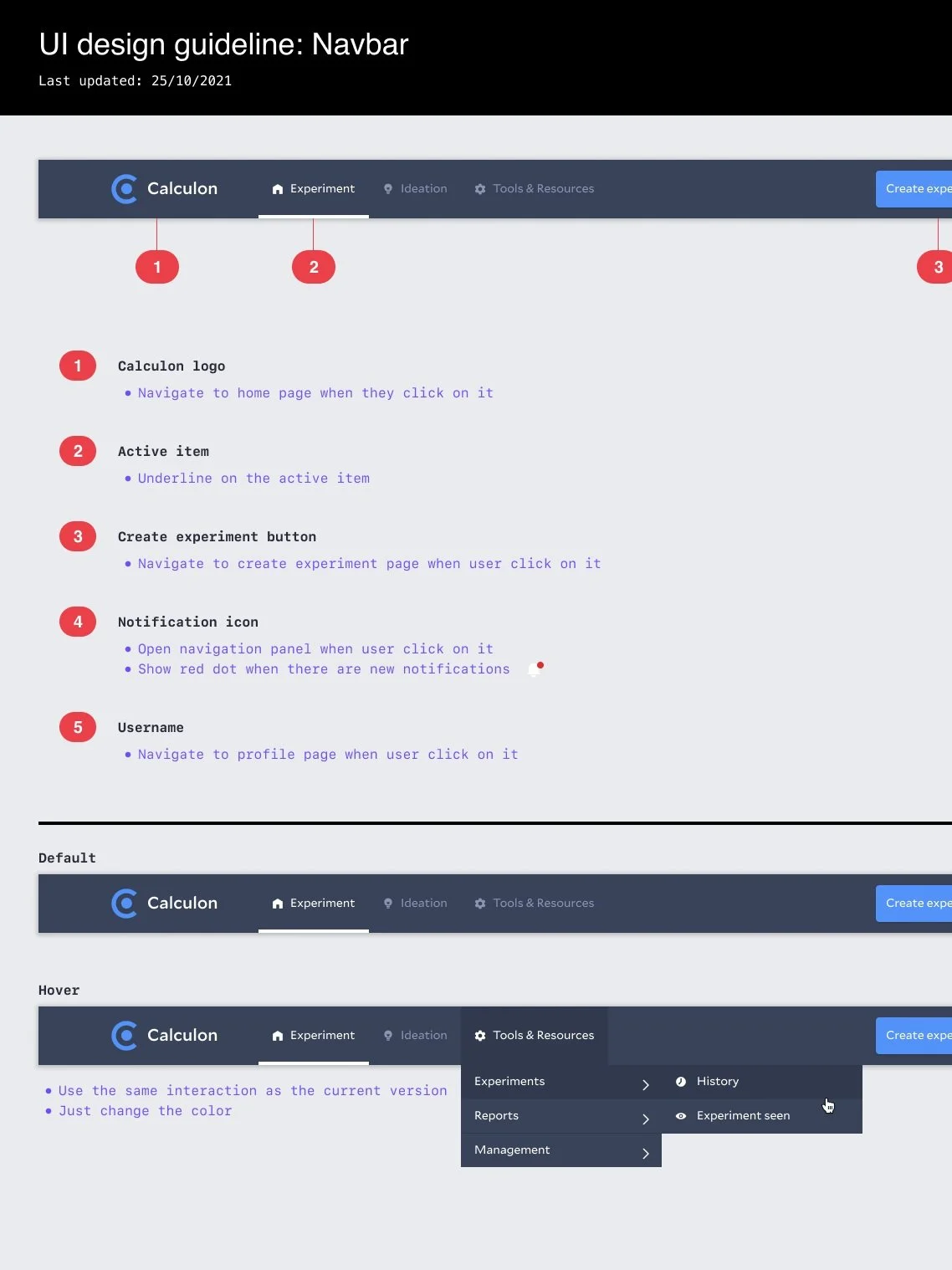
Navigation
Detailed design navigation to help user locate features
-

Summary Card
Enabling users to subscribe to experiments only from their team provides. overall view of running experiements
-
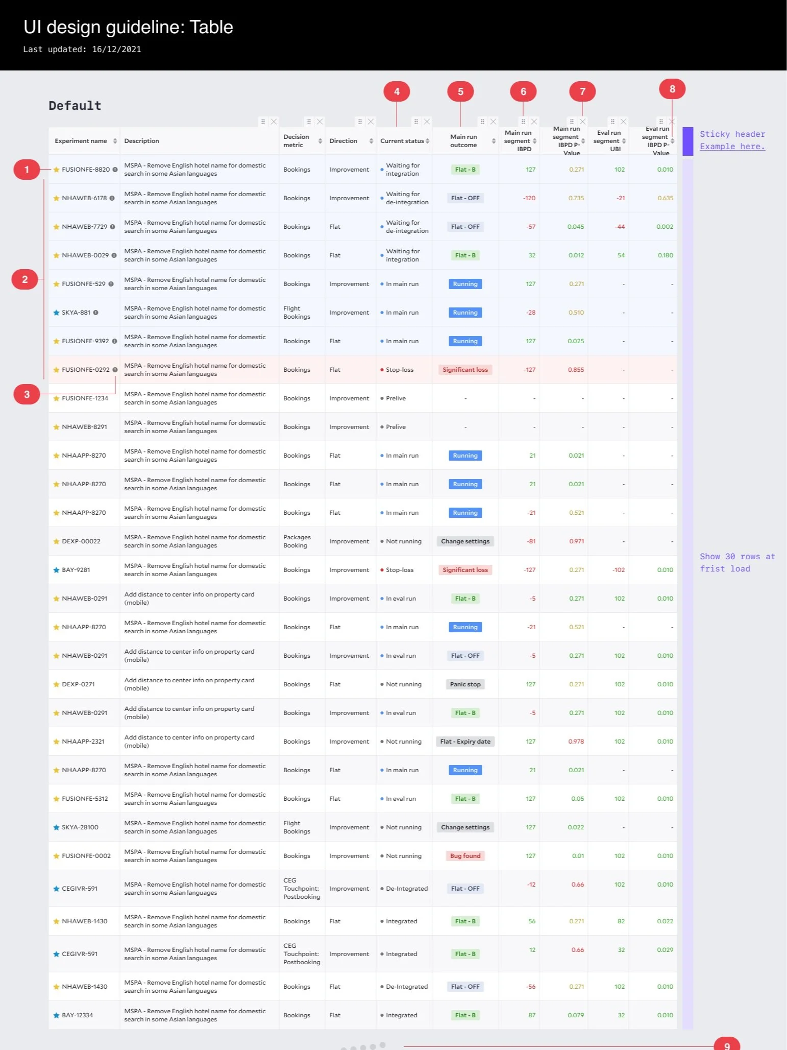
Experiments List
Display as much relevant data points at front helps user to have a good glance of the experiment performance